It strikes me only now that this really should have been sorted in chronological descending order, and not ascending. I'm don't really know quite why I decided this would make sense. At least it's still legible.
Sorry for the mess! It's a wiki and it thrives in mess! But I will get it sorted ASAP :)
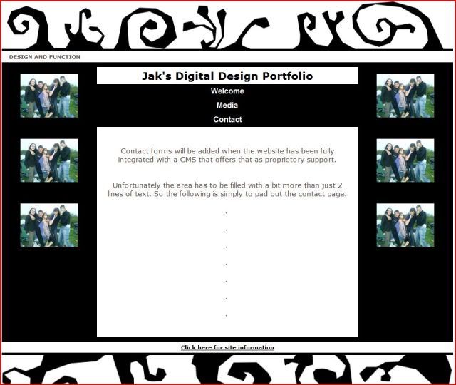
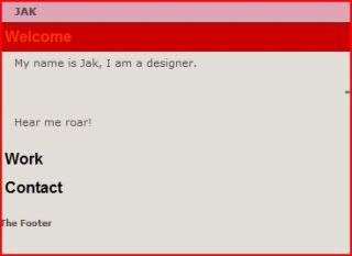
The Final
Although the graphics aren't exactly
what I want them to be and the website still needs more information
on it the project itself is finished.
The website works the way it is
supposed to and due to the way in which the code works and the layout
works adding additional content shouldn't be a problem.
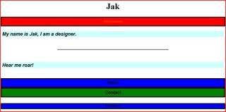
More Graphics Designs
These are just some of the graphics that I have been playing around with. They are not the final graphics, but I needed something to help get me the feel of the website before it's completion.

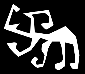


Layout Graphics
I have chosen to go with a slightly
organic feel to the images I have used for the top and bottom of the
website. To give them that digital edge I re-traced the images using
InkScape to give it the more angled look.
While these graphics work at the moment
in any future development they would be the first things to be
changed in favour of something a bit more detailed, less obtrusive
and generally smarter.
The overall aim of this website
development will be to make it as professional and stylish as I can.
However, the aim so far has been to create a strong foundation for
future work.
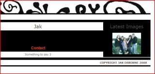
A Couple Rough Layouts
This was the very first look at the website with the accordion effect.
This is simply it coming long a bit further from then.
For the images to load on my website I
wanted to use LightBox to effectively and attractively open the
images over the top of the website. This again is to avoid having to
include any link following. A single page format is what I'm after
and LightBox seems to fit the bill perfectly.
There are a lot of good LightBox
systems out there, almost all of them built on the popular LightBox2
which uses Scriptaculous + Prototype JS libraries. However I have
chosen to go with SlimBox which is based on the MooTools library, a
fraction of the size and can share the MooTools 1.2 library with the
other scripts I have used.
There are almost no differences between
LightBox2 + SlimBox, as well there aren't many differences between
any of the other either. Some manage to offer a bit more
functionality in the form of loading page snaps + flash content, but
I have no intention of using LightBox to load anything but standard
image formats.
Bounce Out
Every website needs a footer, something
to explain what the usage policy is for the website, the author and
his contact details should that be applicable.
When I added the footer to the page it
looked messy having additional text constantly at the bottom of the
website that 9 out of 10 people wouldn't ever want to see.
To rectify this I have given the footer
a bounce out effect from MooTools. Clicking the “Click here for
site information” link will bounce down the rest of the footer
text.
Over time I will include more
information, such as download links for the source and the scripts
that I have used.
Left and Right
On the left and right hand sides of the
website I have 2 content areas that eventually on the right hand side
will contain side bar plugins for WordPress, such as the login and
RSS feeds for the blog. On the left hand side I was going to simply
redesign the website to remove that content area to allow for more
space as simply having images on the left (and right) doesn't quite
work. It causes the website to look over full at a glance.
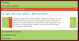
Accordion Effect
The tutorial that I have gone with in
design the accordion effect for my website is one of David Walshes
tutorials on creating simple MooTools effects for your website.
http://davidwalsh.name/simple-mootools-accordion
There were two sorts of accordion that
he gave tutorials on. The first is the one that I am going with, but
the temptation initially was to go with this second one:
http://davidwalsh.name/dw-content/accordion-hover.php
The difference between them is that
while you have to click the headers to navigate through the page
elements in the first one, the second you just hover your mouse over
the selection.
However, this might have proven
annoying to use as you'd constantly have to look at where your mouse
was going in order that you didn't accidently however over a
selection you didn't want to make.
I found the tutorials fairly easy to
follow, and very easy to integrate by themselves. The hard part came
with getting this script to play nice with my other 2 scripts. I
spent hours at first just trying to work out why when adding one
script it would knock out the others, but placing the script calls in
the header in different orders and tweaking the code a little I
managed to get it working. Appparently it was something to do with
variables having the same name in different libraries and Javascript
getting confused and refusing to work.
Having spent hours with different
version of the accordion effect and getting nowhere with some of
them, to far with others before dropping them and finding hordes of
code that just isn't cross platform compatible I stumbled across
this: http://www.stickmanlabs.com/accordion/
This is a dedicated accordion project
based on the Scriptaculous JS library. If I had found this right at
the start of all my work then I would have probably used this over
the MooTools one I have. Simply because this has been developed to be
super stable, offer a lot more customization and functionality.
Another accordion effect that I quite
liked was this one:
http://www.cssnewbie.com/example/css-only-accordion/horizontal.html
It was one of the most simple I'd seen,
but it worked and I quite liked the lack of fancy transition effects.
I could see this script nicely used to display details on a website
that don't need to be over formatted or over sexed.
One of the first drafts of this new
website design using the accordion effect was to build it with the
following script:
http://www.chrisesler.com/mootools/mootools-accordion.html
I really liked the transition between
the selections. I built a lot of the website based on this until I
gave it to a friend to test they rightly pointed out that it would be
a lot nicer if the selections would close again upon the opening of a
different one.
While it's impossible to show you just
how it worked when I used it as I can display a snapshot from it. I
will try to include some of my tests when handing in the work.
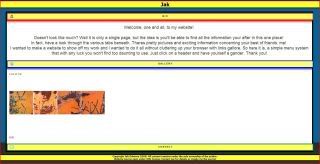
Lack of Content
Due to the fact that I don't currently have any content to put in my website I will be using sample images as place holders for what is to come.
The same applies to the text to some extent as I am not creating a working and popular website for this project so much as I am creating the foundation for building a good online portfolio. The work will be added as and when I have it to add.
A Different Form of Navigation
Having played around with MooTools for
a while now, getting to know the sort of scripts available for public
use and getting to understand the limitations of my ability with the
JS laguage I have decided that although I still really like my
original designs for how the website should look the practicality of
implementing it just wouldn't be feasable.
Instead, I have decided to keep with
the simplistic navigation design but use a different method for
looking at the website. The accordion effect that MooTools supplies
is easy to implement and allows for a single page without need to
load any additional outside data, while still keeping the website
layout clean and clear to navigate.
The best place to see an accordion
effect in action is here:
http://www.solutoire.com/experiments/mootools/acc_ex3.html
I would love to use WordPress with the
K2 theme for the backbone of my website, I have however spent far to
long now with PHP I don't understand and a file system that makes no
sense to me in order to integrate the various javascripts that I want
into the CMS.
It's time now to give WordPress the
kick. I will come back to it at a later date.
I would try and show you the screen
shots from the various attempts I made at getting the CMS to behave,
but the differences between the various designs is one of code and
numbers. It wouldn't make for a very interesting image.
On Navigation
A large part of this project has been spent thinking and researching into good practices for easy and intuitive navigation.
I started playing with the idea of using an MS Windows start button style navigation, meaning there is only one button to look for that will allow you to search, navigate from there without the need to scan through different navigation buttons/bars/sidebars etc etc.
While this still seems to be an excellent solution the problem I found was that if the button is always situated in one place on a website that needs you to scroll through, then you'd naturally have to scroll up to the navigation button each time you needed to navigate. Assuming it's at the top of the page, like my sketches suggested it would be, this would mean you'd have to scroll to the top of the page to navigate. A better option perhaps would be to have the navigation button 'follow' you around the website. This is something I've seen done before, it would be nice to combine that with my plans for a window dial pad navigation.
Google Branding from BrandChannel.com
This is a good article on the branding of Google. It goes into depth about where the logo came from, the aesthetic aim of the company and how it tries to have itself perceived by it's users.
This below is a short snippet from the first part of the article. The link follows, well worth a read.
""
Everything about Google is simple and clear.
Unlike other search engines that have given over to media portals
clogged with banner ads and flashing links, Google has the effect of
putting a cool slice of cucumber over each eye and still being able to
see. As Google spokesperson, Cindy
McCaffrey
notes, “It seems
counterintuitive to the concept of stickiness, but the point of Google
is to allow people to find information as soon as possible and get on
their way.”
""
http://www.brandchannel.com/features_profile.asp?pr_id=30
To save from a messy Wiki I am going to be writing all the
MooTools
tutorials I use and visit here. There will be a lot that I don't write up, simple fleeting passes through a website etc. However, for the ones I do put here I will try to write a short description of the tutorial and what it aimed to teach.
Great
MooTools
examples.
http://speckyboy.com/2008/04/09/41-of-the-best-mootools-ajax-example-downloads/
MooTools
video toots
http://speckyboy.com/2008/04/12/6-helpful-mootools-video-tutorials/
Really good video tutorials on
MooTools
http://beautyindesign.com/tutorial/increasing_user_experience_with_javascript.php
Good
MooTools
toots.
http://www.mootorial.com/
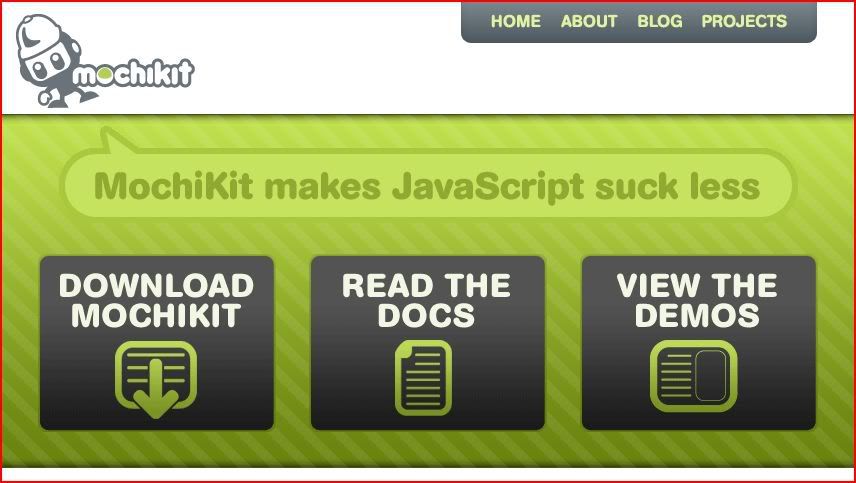
http://mochikit.com/
Like
MooTools
this is another rich and dynamic content Javascript library that boasts ease of use as it's main feature. Just like
MooTools
this library offers some of the basic effects that most JS Libraries offer, only
MooTools
goes further in how far you can take the code. After reading a few dependable websites it would seem that while there is a lot of competitive libraries out there
MooToo
ls and JQuery take the lime light.
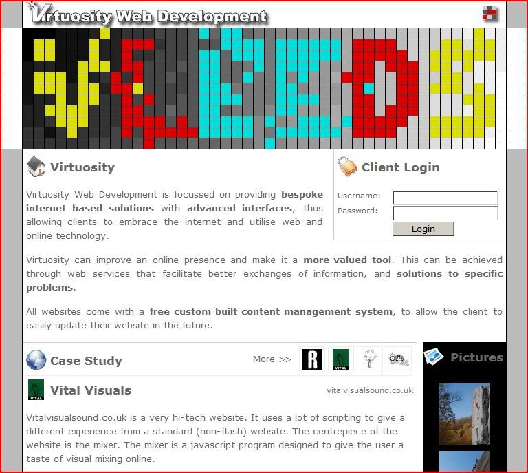
vLeeds
http://www.vleeds.com/
This is a Leeds based web design group who's URL to this website I found nestled at a corner of a piece of graffiti I spotted from a friends bedroom window. The website is a fairly basic blog based idea. It includes a lot of the elements I want to include in my website, such as the
LightBox
enabled picture viewer and the nice Javascript gallery viewer on the main page. The banner has also been spruced up with some nice Javascript that makes the small squares you see move about the area.
The website also has a client log in, which is something I identified as being a good step for my website. This again is something that need not be thought about at this point. Hopefully the client log in will be easy to make as I can combine the already enabled
WordPress
log in to work as a client area as well.
Beauty In Design
I return to this site again via a link I found on another. This time I've been introduced to JoomlaOS. This is a platform for creating a sort of online OS system based on the Joomla! CMS core and utilizing
MooTools
for the effects and window creation.
http://beautyindesign.com/joomlaos/
I'm going to have to learn some
JavaScript
to get me started on all this.
AJAX Contact Form
Because getting in contact with the designer is paramount to actually getting a job offer I will be using a decent AJAX'd contact form that I've used before.
It's highly customization, easy to implement, kept up to date and no hassle to update.
http://www.dustindiaz.com/ajax-contact-form/

To add another degree of professionalism and personalization to my website it might be a good idea to create a new icon set to be used on the website. However, this takes a long time to do and right now isn't entirely necessary. Instead of creating my own for the time being then, I shall be using FamFamFam's Silk icon set which is free for download and use. This is a nice, neutral set of icons that have had a lot of time spent on them. Hopefully they will look right at home on my website.
http://www.famfamfam.com/lab/icons/silk/
.
Kubrick + K2.
Anyone reading this who uses
WordPress
to host their website or blog will instantly know that Kubrick is the default theme of WordPress. They might not know however about Kubrick big brother, K2.
Kubrick is an all purpose, simple, well modeled and responsive theme that comes default installed to any
WordPress
install. K2 was developed by the same team, including the lead programmer of
WordPress
and is designed to be an incredibly easy to adapt theme that supports advanced technologies and ergonomics to produce a web experienced tailored to it's best attempt at providing the user and the admin with the best possible control over the content that they want to see.
I will be modelling my
WordPress
theme on K2. The final outcome may not look in the slightest like the original theme, but that's because I'm using K2 for the functionality it provides by default to sculpt my own web experience over the top of.
http://www.johntp.com/2006/06/09/how-to-create-a-custom-k2-scheme-part-1/
is a great site on instructions for K2 'styling'.
+
http://paulstamatiou.com/2005/12/31/customizing-k2-part-2
http://blog.bull3t.me.uk/archives/wordpress/wordpress-theme-editing/
- LOOK AGAIN
I have indentified
BlueHost
as the best hosting option for the this project. As recommended by
http://wpboy.com.
BlueHost
-
https://www.bluehost.com
BlueHost
offer both unlimited webspace, bandwidth and support. They include a domain name for free.

I have some knowledge of
WordPress
and CMS Made Simple, but Joomla!, and it's previous project Mambo, are considered to be the overall leaders in an open source CMS choice. Because of this my initial choice after researching the various CMS choices became Joomla!. This CMS is the new, sleaker and more advanced (if not so feature pact on vanilla install) of Mambo. I installed a local host server and tried the CMS for a week, getting to know it's layout and difference in design over other CMS that I knew better. It took a lot of effort and a lot of failure to start to understand how this CMS differed and bettered the others but now it's clearly visible. Joomla! is a more advanced CMS, offers more practicle solutions to a feature pact and busy website. However, that's not the bill I'm looking a CMS to fit. My website is to operate on a very basic level, with aditional scripting and functionability added as and when I saw fit to upgrade it. WordPress, while not being as feature pact does have all the capability to match that of a Joomla! powered website. The initial install of
WordPress
does allow me full access to most, if not all the required modules and extensions that I would initially need. I know
WordPress
quite well now. I understand how it aims to suite it's user and I understand how the developers have gone about programming the interface and ergonomics. The question then is why would I chose to user a new CMS, albeit with greater initial function, that offered only extra functions that at this first stage I wouldn't need.
The choice of
WordPress
then, over Joomla!, allows me two extra usable additions. Firstly, the lack of pre-installed support for functions, such as an internet market sales platform, means that when the time comes for me to decide upon an system to support internet sales I will be put in a possition to make a choice based entirely on it's efficiency over any other.
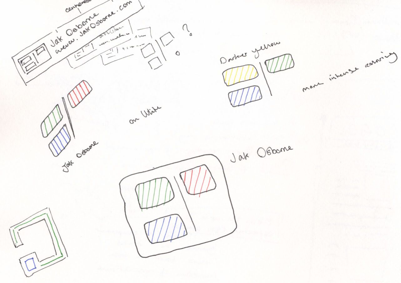
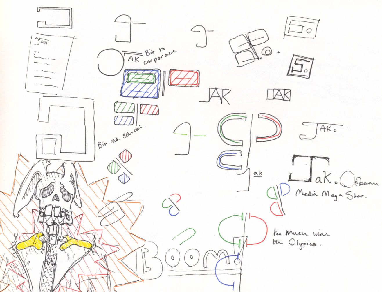
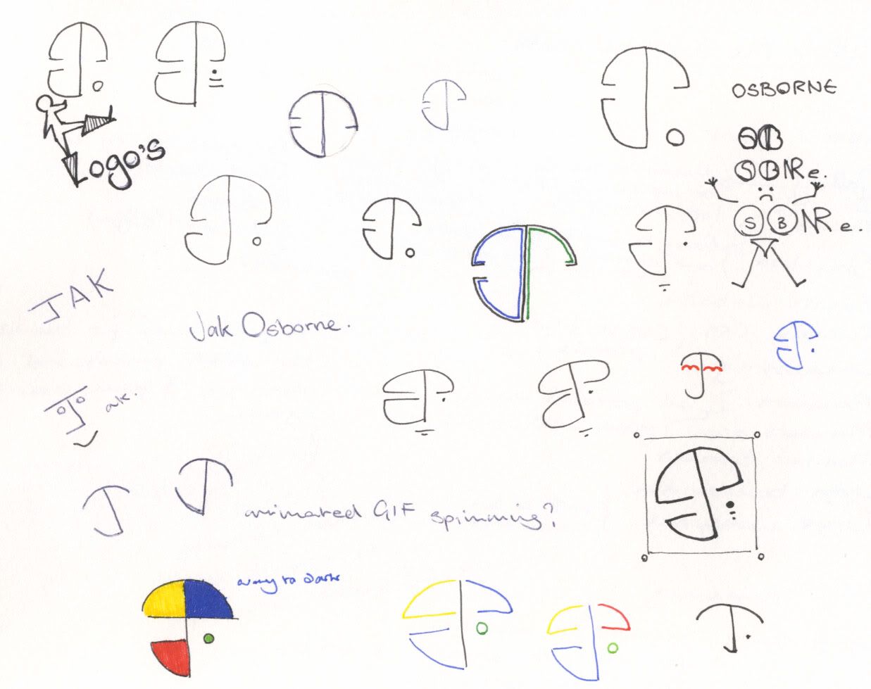
Initial Sketbook Scans
These are some of the better/easier to read and more developed pages from my sketchbook. They depict my initial layout designs and logo designs.
First Prototype Design
Layout Design 3
Layout Design 2
Layout Design 1
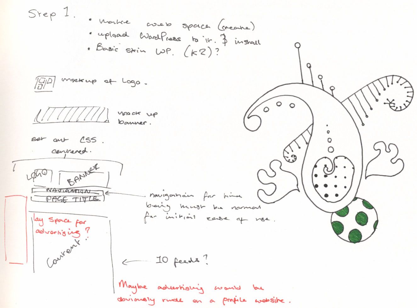
Logo Design 3
Joomla +
WordPress
Compare
Logo Design 2
Designing Interactions
Logo Design 1
Microsoft Dial Pad
Richard Quick
Paul Neave
This is a media designer that I keep on coming back to. Recently he has re-designed his website with this new darker and more stylish front to his work.
Neave.com operates as a sort of compilation of his favorite Flash work. The website attracts views from people who really only stumbled across this website. His work is often referenced in Flash forums and from what I can gather his popularity is growing.
As a portfolio website this works really well. It offers the user and easily navigated UI that helps them discover the best of Paul Neave work.
Demo's and interactive art found on the website can be played with and each piece encourages some sort of personal imagination for it to work.
Each selection to be made on this homepage has with it a nice animation / effect to demonstrate what's to be found on the other side.
This picture below depicts the link to the anaglyph by displaying itself as one.
Creare Design
This website is a bit more complicated compared to the previous one. While it's still fairly easy to use I don't like the scale of it. The website seems to impose itself to much, but the color scheme is nice. This reminds me to get an RSS feed working properly for my main page, should it be a blog.
Good and simple design to the website. It's easy to navigate and looks neutral and inviting.
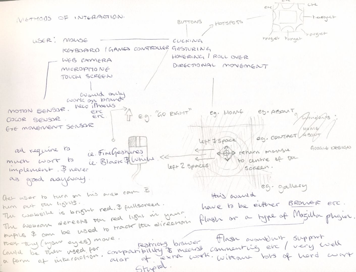
I want to have a go at making a website that doesn't have a usual navigation style. That's not to say that I intend on re-inventing the interaction itself, I just want to show off a form of navigation + interaction that isn't seen on websites all that often.
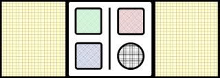
One of my favourite ideas is to use the 'Dial Pad' approach. The example below has been taken from Google Chrome.
I like the idea of using none text based approaches to my work. The dial pad style navigation is intuitive to use and provides easy access to web pages recently visited. Of course I wouldn't use a navigation system like the dial pad to navigate to other websites but to other pages on my website using a graphical navigation system that was similar.
Because images of pages your travelling to on a website that you've not visited before wouldn't make sense, instead of the thumbnail images of the pages I'd use icons in place of the images. Icons to represent the different navigation options available.
I have been looking at icons for inspiration in order to produce my own unique icons. I've been looking a lot at the icons from early computer systems.
The first computer I owned was a really old black and white Mac. It ran slow and did very little, but I loved the way it looked. The simple yet effective icons looked so much more plesant than the over worked icons of today.
I found this good example of icon development through 3 examples each of Mac + Windows.
Having slated the newly designed icons of today I must admit to thinking that the Windows Vista start bar is one of the best developed navigation systems to be found.
While most would automatically take a disliking to the Microsoft approach to things, the Windows start bar still reigns over the other operating systems.
Everything you might need to do on your Windows machine can be accessed through the start bar without needing to touch your mouse. The fast menu search that's integrated into the menu now enables the user to quickly navigate to any application, document or file with just a few taps on the keyboard.
When designing my interaction I will be focussing on creating a system that's obvious and intuitive to use whilst remaining quick and sensible.
The technology I use to create this website will of course have a major effect on how the website looks when it's completed. As I stated below, I wish to create this website with entirely open source and free software. This does mean that I'll have to limit some of my ideas. For instance; I won't be able to use Flash, of which there is no free alternative to high impact graphics. MS
SilverLight
being pretty much the only other option for dynamic graphics integrated into the browser in the same way.
This is OK though. I have no intention to use high end graphics or anything close to high bandwidth consumption.
I believe in open source technology. I believe it's a healthy, productive and ethical approach to design and sharing.
Software
that's been created selflessly by a community of programmers, designers and enthusiasts and upheld by the communities donations and belief in a project.
To that end I wish to design my website entirely from freely available and open source technolgoy. Further to that I want to develope myself as a designer that works solely with open source and free technology. With the money that I save from having to buy expensive licenses I can donate a portion of the proceeds to the projects themselves. I'd rather give my money to people who don't demand it.
However, this does give me a bit of a problem. If I'm using and advocating open source technology then should I release everything I make to be had and downloaded? Perhaps not, I'm selling myself and my skills to others and once I've done that I am not the owner. I cannot give out copies of other peoples websites to the general public, but I can certainly release my own website code as open source.
I feel I'll need a strong branding to help me create an online identity that sticks. First stop is always to consider what ambience I'm trying to create. In this case I'm creating a website that will appeal to a fairly commercial web design aesthetic. To this end I'll need to consider how current online design trends work for other companies and groups.
Initially I want to go with a simplistic web 2.0 feel, without making myself look like Facebook. I'll be looking at how other designers carry themselves online and how larger companies operate a strong branding.
Throughout this project Google has cropped up in my sketchbook as a good company to make a case study on. Their branding is cleverly designed to add a human edge to what is essentially a faceless corporation. Google pioneer the simple and effective approach to design. Their logo's are simple, they don't make use of banners and their color schemes are rarely anything but white + light colour shades.
Microsoft on the other hand create an almost faceless branding for themselves on purpose. They have a strangle hold on the world when it comes to the software + services they provide. The corporate feel of Microsoft, removing the human element, may help back this integration they have with our lives. Microsoft is a toaster, it doesn't need a face, it's just needed. Or so it wants us to think!
Required Functionality
At an initial glance I've identified these items that I believe are considerations in the design of the website. They will also help me make more informed choices about the types of technology I will implement.
Messaging
Media uploads
Easily updated
Easy navigation
Fast + simple interface
Image gallery
Video gallery
News feed
RSS feed
Free/open source
Forum?
Wiki?
Demographic
While my demographic does seem to be quick small, the targetted audience I believe will be harder to reach and appeal to than that of a more general one.
Below I have detailed which key audiences I wish to appeal to and what sort of outcomes I'll need to achieve because of them.
Professionals
- I will need to design the website to appeal to a professional market of people. This after all a professional standard website, I hope.
-
Smart
-
Biast towards my abilities
-
Previous work information(?) CV style?
Designers
- Other designers will always be interested in sizing up their competition or simply just researching other designers approaches. Eitherway, you want to impress your peers.
-
Technically good
-
Advanced
-
Well thought out art/design directions
-
Technical information on the software I use might be appreciated
Students
- Design students in particular may stumble across this website. Hopfully they will. I want the design to appeal imeadiately and at a quick glance. I know how a students concentration waines after only a brief look at anything.
-
Instand design appeal
-
Captivating
-
Lots of imagery or activities to keep interest up?
Employers
- Potential employers will want to get information on previous work as well as being able to contact me. This should be amoungst the most important design consideration.
-
Easy contact solutions
-
Previous clients work on display
-
My background + work history (within reason)
Clients
- It would be great to have a client space that clients can log into to check the progress of their work. This isn't neccessarily a priority 1 point, but it's worth mentioning.
-
Work tracker
-
Clients own space
-
Accounts
-
Integrated messaging
Enthusiasts
- I also want this website to appeal to anyone with an interest in new media design.
Why
I am a digital designer who has had to deal with other designers finding my digital media college blogspot (http://jakalass.blogspot.com), which is far from a professional body of work to be presented as a portfolio. While it demonstrates an understanding of design and new media, it doesn't demonstrate to a potential employer my potential in the industry. It simply shows that I have the ability to criticize other designers work whilst presenting a less than professional approach to design itself. I feel that if I was to create a professional looking and impressive website documenting my work I could start selling myself properly and in seriousness as a fully fledged designer. Which I should be, after 5 years of web design courses.
The idea is that I can start branding myself with an online identity that I can continue to use and improve during and after this courses end. I have high expectations of what I expect this website to be able to do. In the following section I will be discussing the outcomes that I require.
Proposal
I intend to create a branding and web presence for me and my work. It will centre on a professional looking design that is both aesthetically pleasing, well laid out and useful for both work and personal organization and documentation.
The main use this website will allow me is to create a social and professional networking device for use during and after college. I would like it to accommodate my interests in media and design not purely on a professional basis, but so that all information and media accessible within for public viewing should be presented in such a manner that it can be used as a showcase in itself for me as a new media artist.
It's presentation should be stylish, smart, fast, technically advanced and demonstrate to any potential employer that I am a capable designer and already have some professional standard design under my belt.
In order to achieve these goals I will be researching into professional practices in web design whilst concentrating heavily on a very individual styling that will give me the online identity that others will know me by. Research areas will be mostly focussed around other websites similar to my own design goals as well as text book design practices. While I want to demonstrate my imagination in design I don't want to create a website that won't appeal to a more mass audience, albeit concentrating on similarly interested parties. The demographic will be a serious part of the research.
I would like to include a strong element of peer to peer interaction available on the website to try and lure people back. Initially RSS feeds, news letter emails and commenting on posts are easy to implement and would be a good place to start, but I would also like to look into the use of web 2.0 devices to connect users back to my website. This might mean linking somehow to social networking sites or pulling together other web platforms to keep people connected to my website.
The core of this project will maintained by a CMS option of my choice, of which there are a lot to chose from. A major portion of this project will not be on the building of the website itself but rather on the research and asset building required to create a website with the right starting and potential to become a properly realised solution.
Summery
Module Title: Digital Media Development
Brief Title: Design a professional web presence and produce a prototype.
|
The Brief:
To create a branding and web presence for me and my work. It will centre on a professional looking design that is both aesthetically pleasing, well laid out and useful for both work and personal organization and documentation.
| Target Audience:
Potential employers, fellow designers and enthusiasts alike.
|
Mandatory Requirements:
Research into designs and good design practices.
Create a fully realised design plan.
Create a prototype.
| Deliverables:
Sketchbook.
Research.
Fully realised design.
Prototype.
|
Considerations:
The website...
Will need to be impressive enough to draw in potential work.
Should allow for commenting, contacting and potentially allowing for registration to the website.
Must be easily updatable.
Must allow for large uploads of any web media type, rich or otherwise.
Web space should accommodate large downloads and thus have large enough bandwidth available.
| Self Identified Reading List/Research Opportunities:
Designing Interactions - Bill Moggridge
Webworks: Advertising - Thom Forbes
Identity Design That Works - Cheryl Dangel Cullen
Letterhead & Logo Design 10 - Sussner Design Co
Online Branding - Keith Drew
Designing Online Identities - Clay Andres
|
 Uploading ....


